Story of the Day…..Art Samberg (Pequot Capital Management), Lee Cooperman (Omega Family Office) and Mario Gabelli (Gabelli Asset Management) car pooled together to Columbia MBA.
Art Samberg Obituary….He (Arthur Samberg) carpooled to classes with Lee Cooperman and Mario Gabelli, who also became prominent investors.
Arthur Samberg Built Hedge-Fund Giant With Tech Savvy–Electrician’s son made huge profits in 1990s but closed firm amid insider-trading probe
1.Read of the Weekend…The Rescues Ruining Capitalism.
WSJ By Ruchir Sharma
Modern society looks increasingly to government for protection from major crises, whether recessions, public-health disasters or, as today, a painful combination of both. Such rescues have their place, and few would deny that the Covid-19 pandemic called for dramatic intervention. But there is a downside to this reflex to intervene, which has become more automatic over the past four decades. Our growing intolerance for economic risk and loss is undermining the natural resilience of capitalism and now threatens its very survival.
The world economy went into this pandemic vulnerable to another financial crisis precisely because it had already become so fragile, so heavily dependent on constant government help. Governments have offered increasingly easy credit and generous bailouts not only to soften the impact of every crisis since the 1980s but also to try to boost growth during the good times.
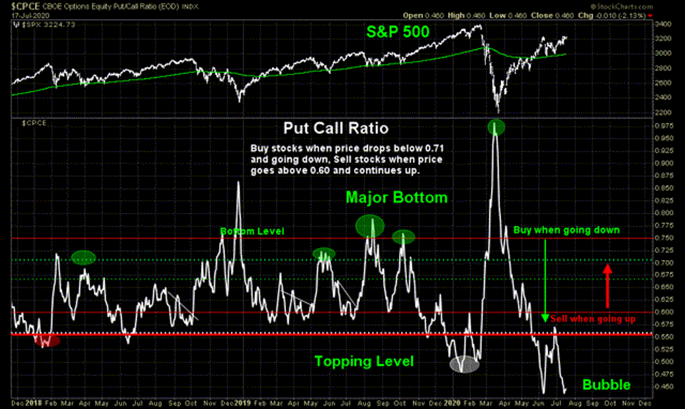
Put. Call. Ratio. Thanks to @ThinkTankCharts for an update on one of our favorite charts – the equity put-call ratio on the S&P 500. This is a red flag if there ever was one. The indicator is back at its June 8 level – beyond extreme. Traders are holding considerably more calls than puts right now, indicative of a frothy market with little concern for downside protection. Corrective price moves can happen fast, and capitulation may come quicker.
ThinkTankCharts provides nice context here – major market bottoms are noted when the put-call ratio spikes, but you can also see when the ratio bottomed as the SPX peaked earlier this year. The June 8 spike down is also evident. Is it different this time? There does not appear to by any good reason why it should be different now.
Bottom line: The bells and whistles should be going off when investors see this chart. It is a huge short-term risk flag being waved. Sticking with the components/theme of this chart, maybe now is the time to consider picking up a little insurance by way of put options to mitigate the risk.
1. Valuations…The List of Companies Trading at 10x Sales is Growing
Advisor Perspectives-20/20 In 2020
“Earnings per share” have been heavily manipulated over the last decade through a variety of gimmicks from “cookie jarring reserves,” to massive “share buybacks.” However, “revenue” is a different matter.
Unfortunately, investors are vastly overpaying for sales as well. Scott McNeely discussed the irrationality of paying 10x sales for a company, then CEO of Sun Microsystems, in 1999 in a Bloomberg interview. To wit:
“At 10-times revenues, to give you a 10-year payback, I have to pay you 100% of revenues for 10-straight years in dividends. That assumes I can get that by my shareholders. It also assumes I have zero cost of goods sold, which is very hard for a computer company.
That assumes zero expenses, which is hard with 39,000 employees. That assumes I pay no taxes, which is very hard. And that expects you pay no taxes on your dividends, which is kind of illegal. And that assumes with zero R&D for the next 10-years, I can maintain the current revenue run rate.
Now, having done that, would any of you like to buy my stock at $64? Do you realize how ridiculous those underlying assumptions are? You don’t need any transparency. You don’t need any footnotes.
What were you thinking?”
Many of the most popular “growth” stocks fit this insanity.
2. Top 10 Companies with Biggest Losses Per Employee
The team at Tipalti analysed data from the Fortune 500 list for some of the biggest companies in the world, and divided each company’s annual profits and revenue by their number of employees, to reveal the losses or profits, and revenue per employee.
The top ten companies making the biggest losses per employee are:
Other brands making huge losses per employee that you may recognise include:
CenturyLink – $-123,973 loss per employee
Wayfair – $-57,969 loss per employee
Tesla – $-17,952 loss per employee
The research also looked at the companies making the biggest profits per employee.
The top ten companies making the biggest profits per employee are:
UBER, TESLA AND WAYFAIR ARE LOSING THOUSANDS IN PROFIT PER EMPLOYEE
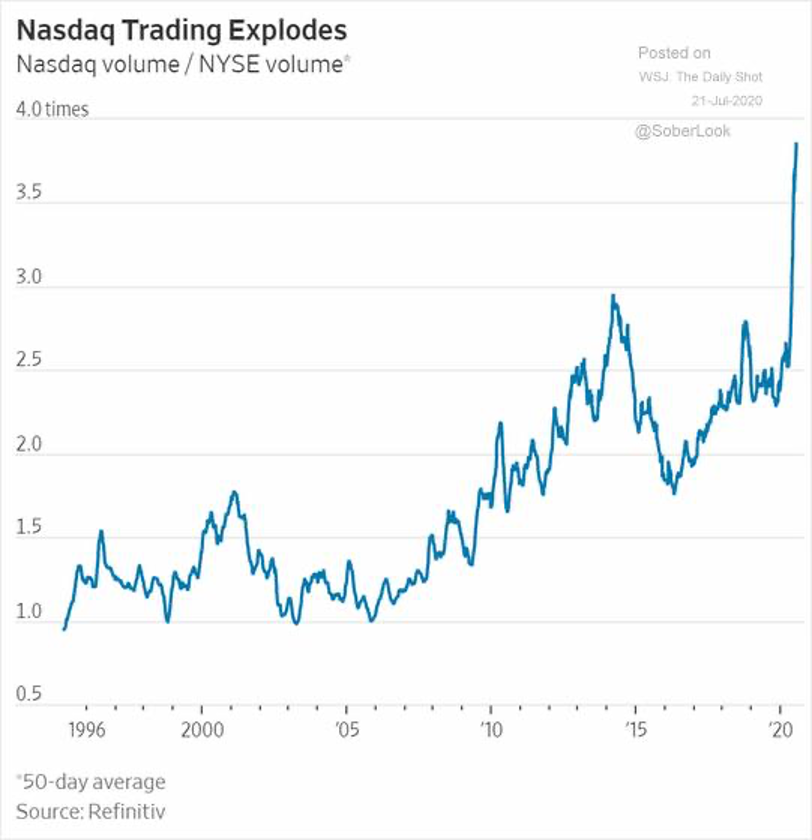
Nasdaq trading volume is “off the charts” this year. (Chart courtesy of The Wall Street Journal) Covid lockdowns, no sports and free online trading, along with a massive sell off and rally. #trading#stocks
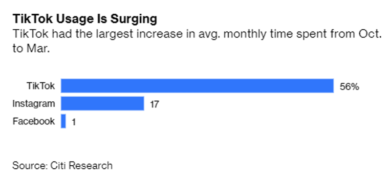
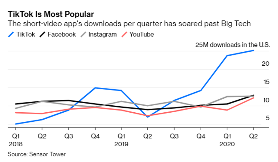
The numbers show surging demand for TikTok’s pure-play short-video platform. Sensor Tower data shows that downloads of the app have soared past its competitors over the last three quarters as more and more Americans take to TikTok as the perfect escape for turbulent times. In another milestone, Netflix added TikTok to its short list of competitors for the first time in its letter to investors last week, saying the app’s growth was “astounding.”
TikTok Is Most Popular
The short-video app’s downloads per quarter has soared past Big Tech
Source: Sensor Tower
TikTok Ban Would Leave a Giant Social-Media Hole–The widely used short-video app, owned by Chinese company Bytedance, is under threat by the Trump administration. Here’s what’s at stake.
Harvard researchers have previously outlined healthy habits for increasing an individual’s overall life expectancy, but new research shows that implementing these habits at age 50 can also reduce a person’s risk for chronic disease later in life. In a new study, researchers at Harvard T.H. Chan School of Public Health expanded on the 2018 study that established five habits in middle health that can boost life expectancy.
This follow-up study, which was published in BMJ, suggests that implementing these five habits into your life can increase your likelihood of enjoying extra years of overall good health.
5 habits to have in middle-age to ward off disease later in life
By now you are probably wondering what those five healthy habits are. Listed below are the five practices you should begin in middle-age to ward off chronic disease later in life:
A “healthy weight” is determined by having a body mass index between 18.5 and 24.9 kg/m2.
“Regular exercise” means that an individual exercised a minimum of 30 minutes a day of moderate to vigorous activity.
Moderate alcohol consumption means an individual consumes one or fewer servings per day for women and two or fewer servings per day for men.
Not smoking means that individuals refrain from smoking in their daily lives.
“Previous studies have found that following a healthy lifestyle improves overall life expectancy and reduces risk of chronic diseases such as diabetes, cardiovascular disease, and cancer, but few studies have looked at the effects of lifestyle factors on life expectancy free from such diseases,” says lead author Yanping Li, senior research scientist in the Department of Nutrition at the university, in a statement. “This study provides strong evidence that following a healthy lifestyle can substantially extend the years a person lives disease-free.”
How many more years of disease-free living do these habits gain you?
The researchers used data from two prior studies, which allowed them to look at data form 73,196 won over 34 years and 38,366 men over 28 years. Like many health matters, the results were different for women and men.
The women who practiced none of the five healthy habits at age 50 lived only 23.7 years free of diabetes, cardiovascular diseases, and cancer. The women who did practice either four or five of these healthy habits lived 34.4 more years free of these chronic diseases. This data suggests that there is a potential gain of nearly 11 healthy years for women who maintained these habits in middle age.
Men saw slightly less benefit from practicing these healthy habits. The men who did not practice any of these habits at age 50 could expect to live 23.5 years free of chronic disease, while men who did practice health habits lived an average of 31.1 healthier years, which is a potential gain of almost eight disease-free years.
Which of these healthy habits matter the most?
The researchers found that smoking and obesity most negatively affected long-term health outcomes. Individuals who were obese or were heavy smokers had the lowest disease-free life expectancy.
10. Five Major Pitfalls That Stop Entrepreneurs by Year 2
By Joshua Stowers, StaffApril 8, 2020
CherriesJD / Getty Images
New businesses often fail when entrepreneurs don’t have the resources or knowledge to properly execute their ideas.
No one likes to fail, but if you do, use the valuable experience you gained to lead your next endeavor to success.
Entrepreneurs tend to fail right before peaking in the business cycle. The peak usually comes after a pitfall, which is where many entrepreneurs lose momentum.
The fear of failure haunts many small business owners. Not only is the road to entrepreneurship often filled with unexpected detours and potholes, but maintaining a high level of creativity and motivation while navigating these roadblocks can be a nail-biting process.
Any successful business venture needs working capital, a sustainable business model and a good understanding of market trends. But what causes a business to fail when you are checking all of those boxes? The answer might depend on how much money your business has or how quickly you can overcome your fear of failure.
What constitutes entrepreneur failure?
You need a lot more than a great idea to be a successful entrepreneur. Even if you have a brilliant idea for a business, your venture is likely to fail if you don’t have the resources or knowledge to execute it properly. Insufficient marketing, a lackluster business plan or even the wrong legal structure can prevent your business from thriving.
The reasons why many entrepreneurs fail early are endless, some being unique to the business owner. The key is to define what “failure” means to you and your business, according to Bill Demas, CEO of Conviva.
“At some level, almost all entrepreneurs fail,” Demas told Business News Daily. “But at the same time, there is a notion that an entrepreneur can’t fail because failure is part of the learning experience, and from those experiences, the entrepreneur builds a business with a higher likelihood of success.”
Demas said it’s better to learn from others’ failures than your own. But if you’ve already experienced a business failure, you should examine the reasons why your startup failed and apply that knowledge to your next venture.
When you’re thinking about how to start a business, one of the most important things to consider is how you will fund your startup. Without working capital, you’ll have difficulty bringing any business idea to life and meeting your overall company goals. This means finding money to start your company – such as through crowdfunding, pitching your idea to potential investors or peer-to-peer lending – and then managing cash flow properly once your business starts generating revenue.
If your startup has no money, failure is likely to be the ultimate result, said Cheryl Roberts, owner of Lexie Jordan Jewelry.
“Let’s face it – even if you started your business as a mission with no money focus, you still need money to further your mission,” she said. “So, the definition of failure as an entrepreneur is failing to make enough money to further your business.”
While generating money is an integral part of entrepreneurship, it’s not the be-all and end-all of success for business owners. Let’s say you’ve defined what failure means to your company and raised the necessary funding – what else could cause your business to fail?
Fear of failure is normal for entrepreneurs; it’s how you maintain interest in your business and motivation in the face of your fears that matters most. Entrepreneurs typically fail not because their businesses fail, but because they lose interest and give up when they don’t see the anticipated results after working for a while, according to Hassan Alnassir, founder and owner of the toy company Premium Joy.
“You need something to motivate you to keep going despite any defeat you feel inside while building your business,” Alnassir said. “A simple way to get motivated consistently and avoid failing as an entrepreneur is to keep an inspiring photo in front of you at all times while working. I personally keep a photo of my little child on the computer desk to push me forward and remain motivated while working on my business.”
Do entrepreneurs always benefit from a business failure experience?
Many entrepreneurs do benefit from business failure. As an entrepreneur, you gain knowledge that most people don’t have because you took a significant risk and saw how it played out.
Failures might seem career-ending at first, but if you think of failing as a learning opportunity, it can be beneficial to your future business ventures. It’s all about your mindset and ability to quickly move forward, according to Georgette Pascale, founder of Pascale Communications.
“The truth is entrepreneurs have to have thick skin, take the blow of their misstep, and know there will eventually be a benefit from this experience,” Pascale said. “They’ll learn something new and learn not to repeat mistakes again. Most importantly, this experience should be taken in stride, and plans must be made to move onward quickly.”
When in the business cycle do most entrepreneurs tend to fail?
Entrepreneurs tend to fail right before peaking in the business cycle. The peak usually comes after a pitfall, which is when many entrepreneurs lose momentum. If you can make it through the recovery process after a major pitfall, expansion is often on the horizon.
The U.S. Bureau of Labor Statistics’ Current Employment Statistics program helps identify the key cyclical phases with the CES peak-trough tables. These phases mark the beginning of periods of positive or negative growth in your company’s life cycle. Each phase usually fluctuates monthly, depending on your product or service.
While the exact point when an entrepreneur is at risk of failure varies, most fail after they’ve been in business for a year or two, according to Andrew Gunderman, CEO of Vyra.
“This is because things get much more real around this time,” he said. “You’re likely bringing on new employees, which means increased costs. When it’s just you and the founders and you’re not taking on salary, it’s easy because you can pivot on a dime.”
Gunderman says having to pay employees makes it harder to pivot, and the cost of having those employees can put you in a position in which there’s no way out. This can lead to early bankruptcy.
Five major pitfalls that stop entrepreneurs by year two
Below are the five major reasons why entrepreneurs fail by their second year in business, according to Amanda Kendall, owner of Elevating Profits.
1. Cash flow
When starting a business, entrepreneurs are usually focused on the next sale and the next client. They often don’t think about the long term or plan for the future. Cash flow can make or break a business. A business without profits can survive for years, but a business without cash flow will fail within months. Planning for how to maintain positive cash flow can get your business through the lulls that are bound to happen.
2. ‘I have to do it all’ syndrome
Entrepreneurs wear multiple hats when they start a business. Sometimes they forget that, in order to grow, they must pass some (if not most) of those hats to other people along the way. This mentality of “I can do it all, faster and better” sinks many entrepreneurs. Learn to exit roles, and have a plan of what that looks like. Who fills that role as you exit it? What does that free you up to do now? What is the next role you will exit?
3. Sales and marketing
Entrepreneurs often think that all their friends and family will buy from them when they start out. Sadly, this is often not the case. You need to have a strategy for sales and marketing. Know who your ideal client is, and then go teach them why they need your service or product. If you wait for the sales to just come in, you will be waiting a long time.
4. Underpricing
Entrepreneurs want to be competitive in the market, so they price themselves under the competition to gain more clients. This results in lots of hours for little to no profits. When an entrepreneur does not plan out their pricing intentionally, they are offering a service that costs them money to fulfill. Pricing for profitability is essential, yet too rarely done.
5. No big vision
When entrepreneurs start their business, they know what they want to do, who they want to help and why, but they don’t plan out what that will look like in three to 15 years or what the final exit plan is. An exit strategy gives you a solid map to follow for the entire life of your business. Without it, you are on a road trip wearing a blindfold.
Tips that could keep an entrepreneur from failing
The best way to successfully launch your startup is to establish short-term and long-term goals. Having top-notch operational capabilities – including good management, financial planning and a solid work-life balance – can help your company make it beyond its second year. Here are seven tips to help you keep your business running past the two-year mark.
Surround yourself with the right people. People who believe in you can provide great support and advice. This can help you stay focused on the big picture of your business, no matter what pitfalls come your way.
Keep up to date with your industry. It’s crucial to continue your research and gather as much knowledge as possible about your market, because the business landscape can change quickly. You need to look ahead so you can improve your products or services to stay on trend and in demand.
Plan for continuous growth. Manasi Gangan, founder and CEO of Nested Bean, says planning for continuous growth helps keep entrepreneurs from failing. You can plan for continuous growth by creating inflection points through an ongoing cycle of product innovation, then channel diversification and, finally, geographic diversification. You must create these inflection points when things are good and you’re growing, not when the plateau hits.
Share your vision. Share your vision by hiring a diverse team with entrepreneurial spirit. You should hire people who share your vision and believe in you and your ideas.
Inspire others. Foster a culture of learning and a productive mentality until it becomes the norm for your team. You should create smaller goals and benchmarks to keep your team motivated and on course.
Create a culture of learning, iterating and automating processes. A big factor in building a successful business is swinging for the fences and trying new things until you find something that works for you.
Stay motivated. Take your long-term, overarching goals and break them down into smaller tasks and goals. Then, when you have wins, celebrate them! This makes the big goals seem less daunting and more easily achievable. [Read related article: 101 Reasons Being an Entrepreneur Rocks]
Lansing Street Advisors is a registered investment adviser with the State of Pennsylvania.. To the extent that content includes references to securities, those references do not constitute an offer or solicitation to buy, sell or hold such security as information is provided for educational purposes only. Articles should not be considered investment advice and the information contain within should not be relied upon in assessing whether or not to invest in any securities or asset classes mentioned. Articles have been prepared without regard to the individual financial circumstances and objectives of persons who receive it. Securities discussed may not be suitable for all investors. Please keep in mind that a company’s past financial performance, including the performance of its share price, does not guarantee future results. Material compiled by Lansing Street Advisors is based on publically available data at the time of compilation. Lansing Street Advisors makes no warranties or representation of any kind relating to the accuracy, completeness or timeliness of the data and shall not have liability for any damages of any kind relating to the use such data. Material for market review represents an assessment of the market environment at a specific point in time and is not intended to be a forecast of future events, or a guarantee of future results. Indices that may be included herein are unmanaged indices and one cannot directly invest in an index. Index returns do not reflect the impact of any management fees, transaction costs or expenses. The index information included herein is for illustrative purposes only.