1.Interesting Comments on Market Breath….Narrow Leadership.
Average Small Cap Stock in “Bear Market” Territory
Oct 9, 2018
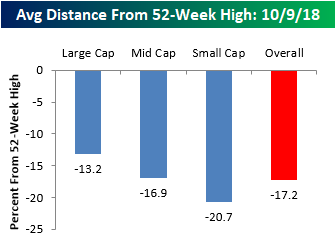
Most people watching have noticed that the recent weakness in equities has been especially tough on the small-cap space, and another illustration of that trend is to look at the distance that stocks are currently trading from their 52-week highs. Within the large-cap S&P 500, the average stock is currently 13.2% below its 52-week high. Moving down the market cap spectrum, though, the numbers get progressively worse. In the S&P 400 mid-cap space, the average spread is 16.9%, while members of the S&P 600 Small Cap index are down an average of 20.7%. Using the standard bear market definition of a 20% decline from a high, the average small-cap stock is in a bear market!
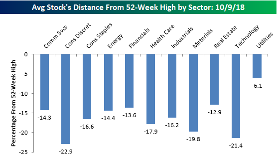
Looking at the spreads between current prices and 52-week highs, stocks in the Consumer Discretionary sector are further from their highs than any other sector (-22.9%), but Technology isn’t far behind at 21.4%. For two sectors that were market leaders, Tech and Discretionary have certainly seen a good deal of profit-taking lately. Outside of these two, other sectors where the ‘average’ stock has seen a pretty sizable pullback from its 52-week high include Materials (-19.8%), Health Care (-17.9%), and Consumer Staples (-16.6%). On the other end of the spectrum, Utilities (-6.1%) is the only sector where stocks are currently down by an average of less than 10% from their 52-week highs.