1.The Ratio of Negative Earnings Guidance is the Worst in a Decade
From Callum Thomas Chart Storm –Earnings Guidance: From boom to gloom. One explainer for this chart is the fact that the pandemic gifted a lot of companies a *one-off* surge/pulling-forward in growth (e.g. zoom, peloton, netflix, etc) — something that could not be repeated. Add to that rising cost pressures and signs of a slip in growth momentum and the picture below begins to seem the obvious outcome.

Source: @C_Barraud Callum Thomas https://www.linkedin.
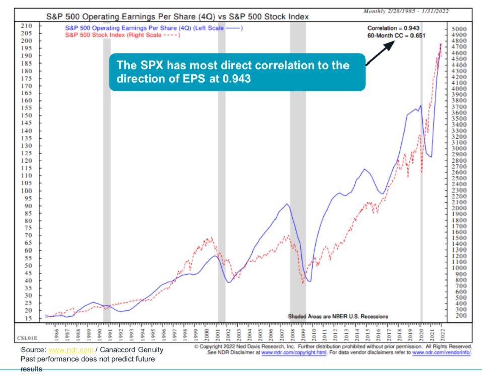
2. Fed Raising Rates in an Expensive Market
Zerohedge –But an even bigger risk to the upcoming tightening cycle, where banks are now rushing to outbid each other on how many rate hikes they think the Fed will let loose before sending the economy into a recession, is that as Bank of America’s Savita Subramanian writes, the “key risk today is that the Fed is tightening into an overvalued market.”
Indeed, the S&P 500 today is more expensive ahead of the first rate hike than any other cycle besides 1999-00 (23x P/E vs. 30 P/E) and everyone remember what happened to the Nasdaq then. Making matters worse, this time the real cost of debt is negative, where in ‘99, the cost of equity was negative. The Fed Funds rate increased by 150bp during that cycle, and the market was up during the hiking, but the S&P peaked in March of 2000, and subsequently declined by 49% over the next 2.5 years
https://www.zerohedge.com/

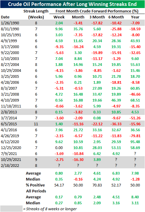
3. Crude Oil First Weekly Loss in 8 Weeks.
Bespoke –The rally over the past few months has been very consistent for crude oil. In fact, crude oil is on pace for its first weekly loss in eight weeks. Historically, it has been uncommon for crude oil to rally for such a long span. Since 1983, there have only been five other weekly winning streaks that have also gone on for at least 8 weeks in a row. The most recent of these ended at nine weeks last October.
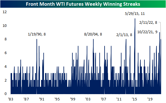
Below we show the performance of crude oil following each time that it has ended a winning streak of at least 6 weeks, of which there have been 24 since 1983. Performance following the end of these streaks has been mixed with positive performance around 50% of the time one week, one month, six months, and one year later across these instances. Three returns, however, have more consistently seen positive returns which have on average been larger than the norm.
https://www.bespokepremium.com/interactive/posts/think-big-blog/crude-oil-snapping-a-historic-winning-streak
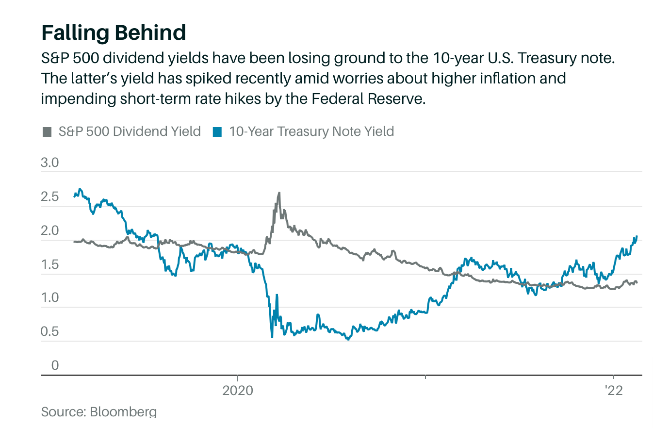
4. 10 Year Treasury Yield Now Higher than S&P Dividend Yield
Lawrence C. Strauss Barrons
https://www.barrons.com/articles/rising-treasury-yields-are-diminishing-the-appeal-of-dividend-stocks-51645215301?mod=past_editions
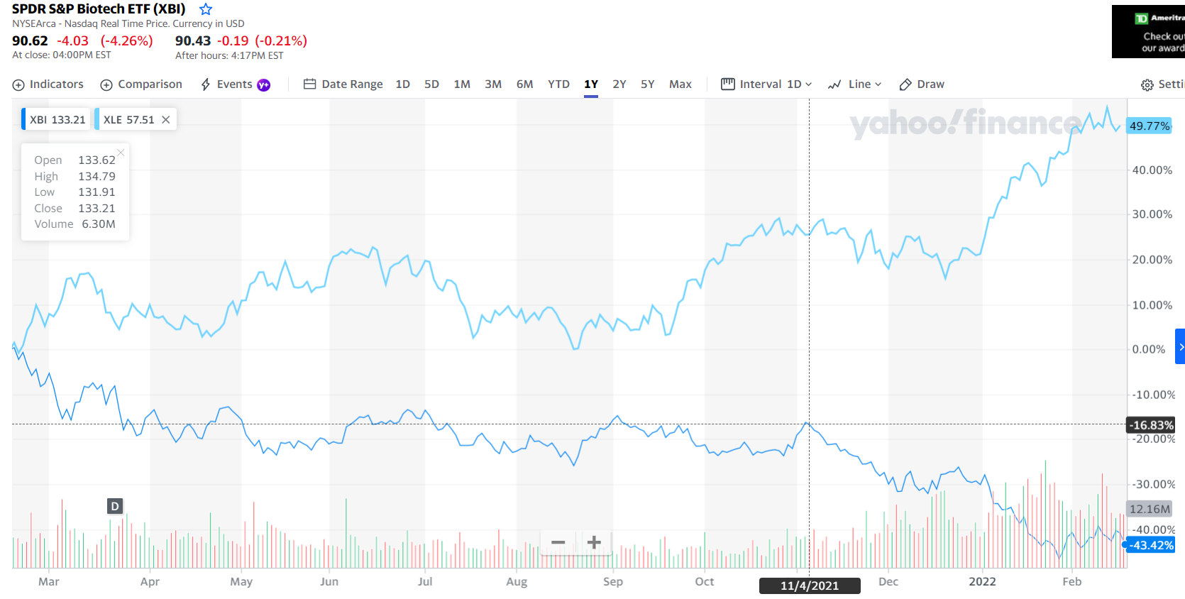
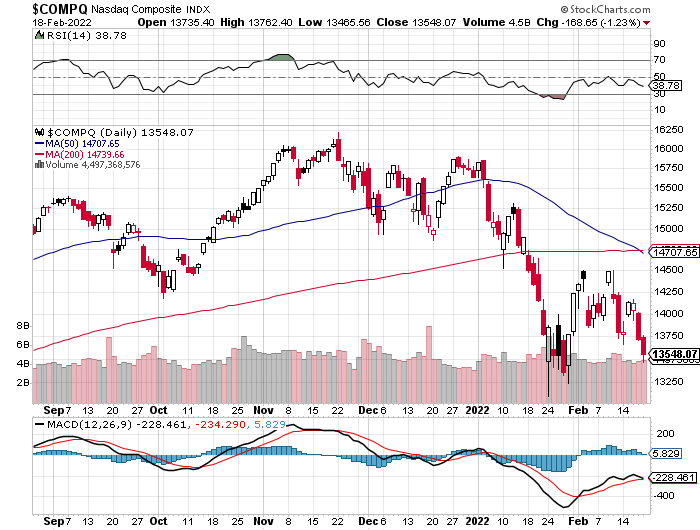
5. Nasdaq Composite Bearish Technical Indicator….50day Crosses Below 200day
Nasdaq is testing previous low…see if it breaks this week
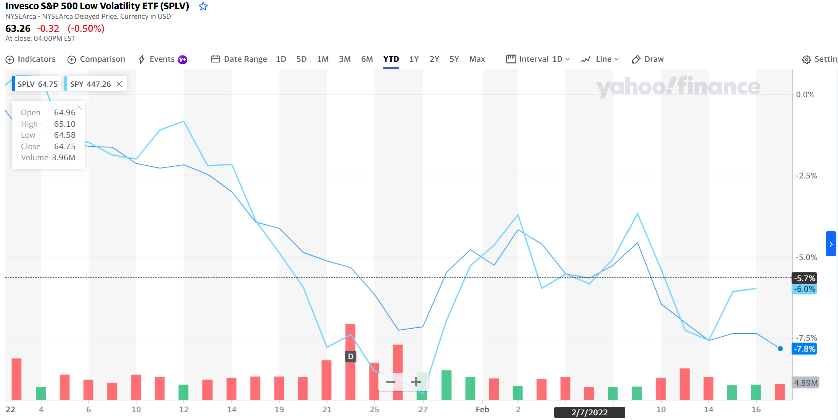
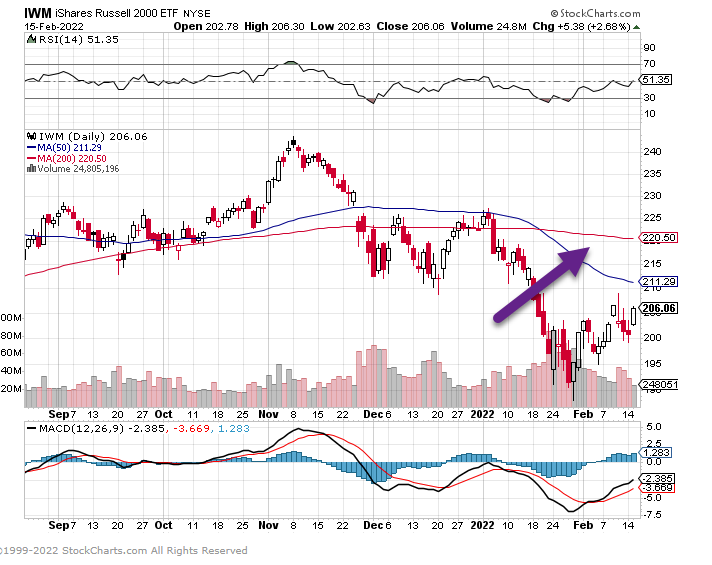
6. Microcap Stocks -25% Correction from Highs.
Microcap ETF bounce but full correction of 25% top to bottom

IWC Microcap also breaking BLUE uptrend line going back to 2020

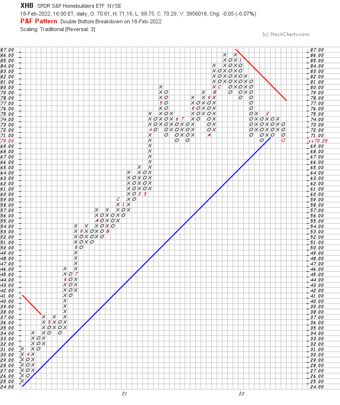
7. Homebuilders Break Previous Lows
Homebuilder ETF breaks October 2021 Lows
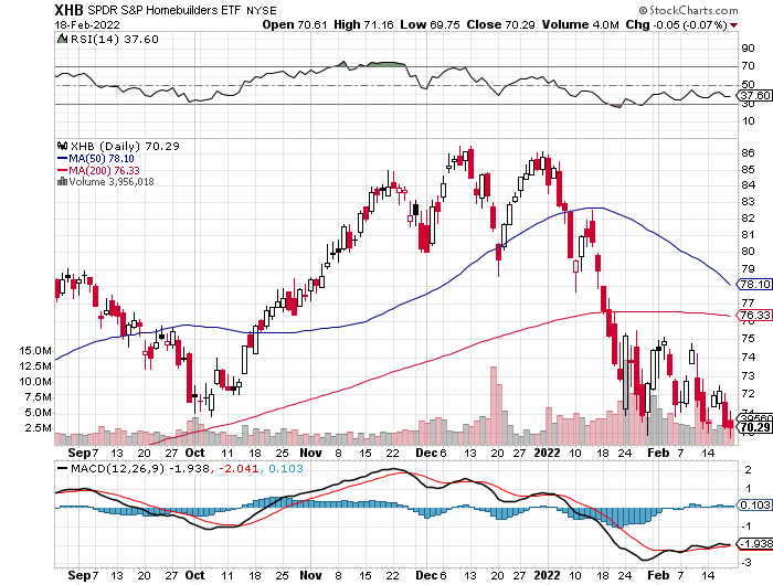
Homebuilders breaking an uptrend BLUE line going back to 2020….$69 would be clean break on chart
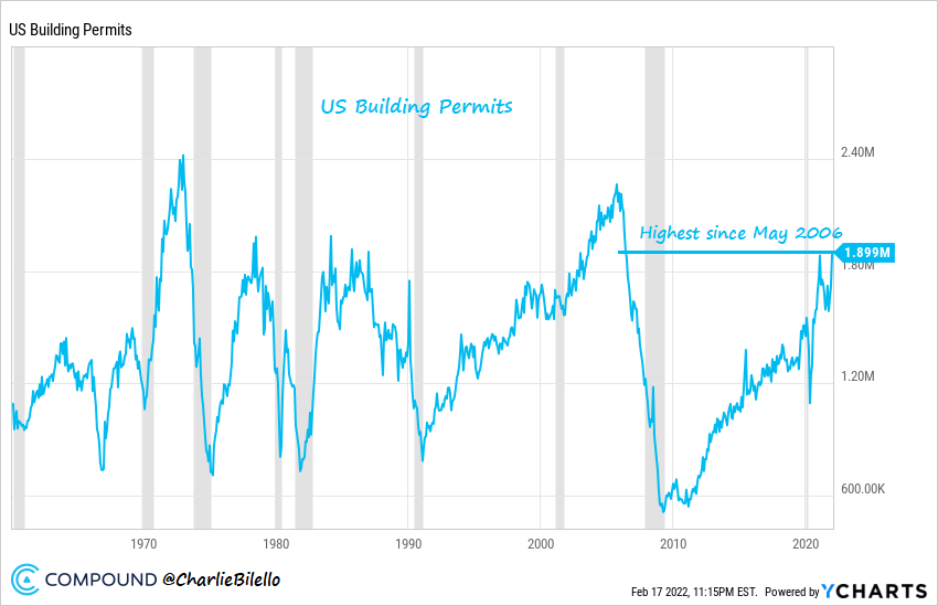
8. Housing Battle Between Massive Demand vs. Low Supply …And Now Possible Lack of Affordability (high prices/rising rates)
Home Supply is Finally Coming as Building Permits Hit Highest Levels Since May 2006
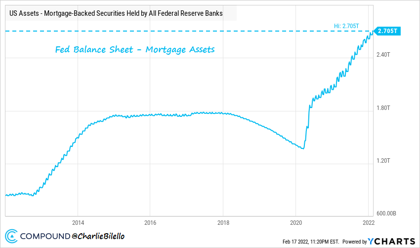
@Charlie Bilello The US Housing Boom continues with Building Permits rising to their highest levels since May 2006.
Incredibly, the Fed is still stimulating, with holdings of mortgage-backed securities hitting another record high.
|
Incredibly, the Fed is still stimulating, with holdings of mortgage-backed securities hitting another record high.
|
9. Here’s How Jeff Bezos Spends His Money
Kate PrinceBusiness Investing.com
1. Cruising the Aegean Sea
Year Purchased: 2021
Estimated Value: $70 million* (Price of Eos yacht)
Before Jeff Bezos went to space in 2021, he went on a cruise. He was spotted visiting the Greek Islands aboard a super-luxurious yacht. He went on a cruise of the beautiful Aegean Sea, and he was spotted having dinner at Omega3, a cosmopolitan restaurant in Platis Gialos, located on Sifnos, a Cycladic Island.
Advertisement
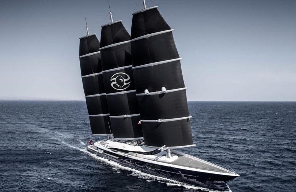
Bezos wasn’t alone for this cruise. He went sailing with his fellow billionaire businessman, Barry Diller. Diller’s wife is famed fashion designer Diane von Furstenberg. Also along for the trip was Anderson Cooper, a journalist and anchor at CNN. The trio sailed on Eos, one of the world’s largest sailing yachts. Eos is owned by Diller.
Advertisement
2. Dog sledding above the Arctic Circle in Norway
Year Purchased: 2018
Estimated Value: $150-$250*
The Arctic Circle runs straight through the middle of Norway, and it is one of the country’s biggest tourist attractions. Not everyone can afford to travel there, but Jeff Bezos certainly can. The billionaire not only took a vacation there; he also dog-sledded, posting a lot of pictures from his vacation.
Advertisement
above the Arctic Circle in Norway @JeffBezos / Twitter.co
Bezos talked about going dog sledding above the Norwegian Arctic Circle, saying on Twitter that it inspired him to “go to space to save the Earth.” He said that he believes Earth is the solar system’s “best planet,” and we have “no plan B” to save it.
Skip Ad
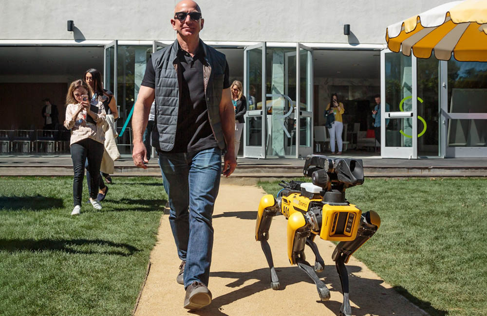
3. A “robot dog”
Year Purchased: 2018
Estimated Value: $75,000*
Robots of any kind are impressive and worthy of a few thousand dollars, but what about a robot dog? They aren’t quite as easy to cuddle up with at night, but that didn’t stop Boston Dynamics from creating the SpotMini. Jeff was pictured with the new dog in 2018.
Advertisement
Advertisement
It’s thought that Spot costs around $75,000, but what do you get for that price? Apparently, a 55-pound pooch can race around the garden for 90 minutes before needing to be charged up again. Doesn’t sound quite as fun as Fido, does he?
4. Wimbledon Tickets
Year Purchased: 2019
Estimated Value: $1,300 per day*
Jeff Bezos made his public debut with his new girlfriend, Lauren Sanchez, in 2019. He and Sanchez attended the men’s Wimbledon final, which saw a thrilling match between Roger Federer and Novak Djokovic. He and his girlfriend sat right behind the Royal Family during their five-hour viewing of the match.
Wimbledon tickets aren’t cheap, especially if you’re sitting in the front row. Celebrities, from actors to musicians to CEOs, have been seen at the famed tennis match, smiling for the camera. Tickets can cost up to $1,300 a day for the best seats in the house, like the ones Bezos and Sanchez had.
5. 11-Minute Flight to Space
Year Purchased: 2021
Estimated Value: $4.4 billion*
Jeff Bezos described his adventure in his Blue Origin New Shepard capsule, which is autonomous and doesn’t require a pilot, as “the best day ever.” The eleven-minute spaceflight included the billionaire and three crew members, one of which was the oldest person to travel to space and the other the youngest.
The spaceflight cost $4.4 billion. Bezos’ entire flight was eleven minutes, but he only spent three of them actually in space. The flight wasn’t overly risky, as the New Shepard capsule had never had an accident in fifteen spaceflight tests. Blue Origin was founded in 2000, and, twenty-one years later, Bezos saw the fruits of his company’s labor.
6. Wind Farm in Ireland
Year Purchased: 2021-2022
Estimated Value: $23 million*
Jeff Bezos recently stepped down from his position as the head of Amazon to focus on his more pressing interests: space travel and eco-friendly energy generation. He’s attempting to achieve the latter through three wind farms which are located in the remote Irish town of Esk, near Balligree.
The 23-megawatt farms are the first to be built using all-private funding. Bezos commissioned the windfarms in the hopes of using power to offset carbon emissions that Amazon data centers, also located in Ireland, emit. The first of the three wind farms opened in 2021. The other two are expected to become operational by 2022.
7. Four City Blocks in Seattle
Year Purchased: 2012
Estimated Value: Part of the $4 billion Amazon campus*
In order to make the huge Amazon campus that he dreamed of, Jeff had to buy the land first. Incredibly, the Amazon campus in Seattle runs across four whole blocks. That’s an incredibly large area of land that would have cost a fortune to purchase.
It’s not clear just how much Bezos spent on it, but it would have been an eye-watering amount of money. Still, every tech giant needs its state-of-the-art HQ and Amazonwasn’t about to fall behind when everyone else was racing forward.
8. Google
Year Purchased: 1998
Estimated Value: $1.885 trillion*
Google currently has a market cap of nearly $2 trillion, making it one of few companies to achieve this feat. In 1998, things looked a lot differently for Google. The tech company’s headquarters, run by Larry Page and Sergey Brin, were in a garage in Menlo Park, California.
Jeff Bezos saw something in the tiny company, and he invested $250,000 into the venture. The investment in the startup is now up 20,000% today, and Bezos has cashed in on his now 3.3 million shares of stock. These shares are worth over $3 billion today. Bezos’ Google investment is yet another example of how his belief in tiny startups has made him billions.
9. Uber
Year Purchased: 2011
Estimated Value: $76.54 billion*
Though Amazon, as a company, has invested in Uber competitors, Jeff Bezos has his bet on a different horse. The tech billionaire put $3 million into the ride-sharing company, and he watched that investment pay off handsomely. Now, that paltry-seeming $3 million is worth around $400 million.
Bezos was one of the first investors in the app. Benchmark invested $30 million, and the company made $7.9 billion from its early investment. Bezos has an eye for good business opportunities, and he definitely placed the correct bet with this multi-million investment. Even Travis Kalanick, the ousted founder of Uber, made $9 billion from his 8.6% stake.
10. Whole Foods Market
Year Purchased: 2017
Estimated Value: $13.7 billion*
There’s a lot of money to be made in online groceries – and Jeff knows it. He’s been trying to break into the online grocery games since 2007, but despite creating AmazonFresh, it never really became a big player.
Jeff didn’t give up his dream though, and purchased Whole Foods through Amazon for $13.7 billion in 2017. This certainly helped boost Amazon’s position, but it’s still a big work in progress. Buying a trusted brand, Whole Foods, was a smart move on Jeff’s part and could be the key to future success.
10. How to Turn Discipline into Consistency
Farnam Street Tiny Thought–One of the most practical life skills that no one talks about is turning discipline into consistency. Discipline will only take you so far. It’s hard to be consistently disciplined.
Relying on discipline to do what you know you should do requires a lot of effort. But what if you could take that discipline and turn it into something that happens without much effort?
Consider my twelve-year-old son who has about an hour of homework a night with his Grade 7 class. If we relied on discipline to get that homework done, it would be a mess. Sure, some nights it would be easy but other nights it wouldn’t. I can almost hear the excuses now. “Dad, I don’t feel like doing it now. I’ll do it later.” In the end, what he did would depend on how he felt.
Doing things when you feel like doing them won’t get you the results you want. If you don’t feel like doing your job, you get fired. If you give it 50% because you don’t feel like practicing, you sit on the bench while other kids play in the game. If you don’t feel like studying, you get a crappy mark. That’s not to say that feelings are not important — they are — but they’re also a luxury when it comes to doing things.
The most successful people consistently do the thing they’re great at. They do it on easy days and they do it on hard days. They do it when they feel like it and when they don’t. Only what I’ve learned is that they’re not more disciplined than you or I. So how do they do it? The answer is they create a ritual.
The power of rituals can be easy to overlook because they seem so simple. Rituals include habits, systems, and even group traditions.
Once started, rituals are hard to stop. Think of rituals as anything structured that creates inertia. Not all inertia is positive. Your rituals can work for you or against you. And their mechanical neutrality is key to using them to your advantage.
Instead of relying on motivation to do homework, we started a ritual after school. Come home, shower, get a snack, and start your homework. As the days turn to weeks the structure takes hold and becomes the path of least resistance. Now, he consistently does homework every day, even when he doesn’t feel like it. The ritual took over.
What looks like skill is often just consistency. While you can’t snap your fingers and become more talented, you can create your own talent. Consistency creates talent. And you won’t be consistent if you only do things when you feel like it.
When people seem uncommonly disciplined, look for a powerful ritual hiding in plain sight. It’s not that they have more discipline than you or I, but they were able to turn that discipline into consistency with a ritual. Short-term results come from intensity but long-term results come from consistency. Turning intensity into consistency unlocks a powerful asymmetry.
(Share This Tiny Thought on Twitter).
Explore Your Curiosity
★ “There’s this premise that the success of player depends on ability, which is made up of technical, physical, tactical and phycological aspects, and that this is then multiplied by their availability,” the doctor points out during the interview. “Many players have told me that Arjen Robben could have been close to Cristiano Ronaldo or Lionel Messi in ability, but he didn’t make it because he didn’t have much availability.”