1. Divers Rescue Path.
Source: WSJ.com, h/t Paul Menestrier; Read full article

Can Companies Keep Up Strong Beat Rates in Q2 Earnings Season?
Jul 11, 2018
One thing we’ll be watching closely this earnings season is whether companies can keep up the extraordinarily high beat rates seen over the past two quarters.
Over the past two earnings seasons, even though analysts had to up their estimates quite a bit due to the Trump corporate tax cuts, companies were easily able to beat expectations. Since 1999, 62.1% of earnings reports have reported EPS that were greater than consensus expectations. As shown below, though, the last two quarters saw much higher than average beat rates.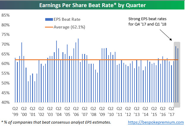
Not only have bottom line EPS beat rates been strong, but top-line revenue beat rates have been strong as well. Revenue beat rates over the last two earnings seasons were higher than any quarter since Q4 2004.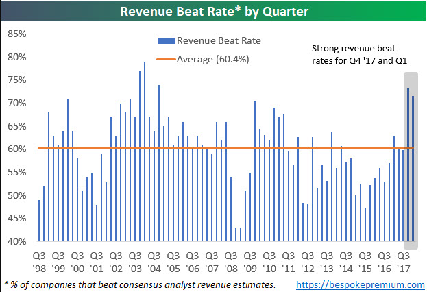
The chart below takes the average of each quarter’s earnings and revenue beat rate. When looking at the strength of both the top and bottom line beat rate each earnings season, the only other two-quarter period that showed stronger beat rates than the last two quarters was back in Q4 2003 and Q1 2004.
Needless to say, investors have gotten used to stronger than expected earnings reports over the last six months. If companies aren’t able to keep up the pace this season, we think the market will struggle.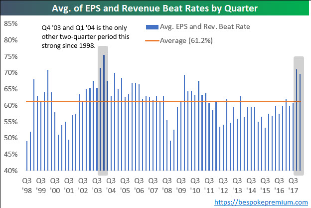
By Stephen Grocer
July 3, 2018
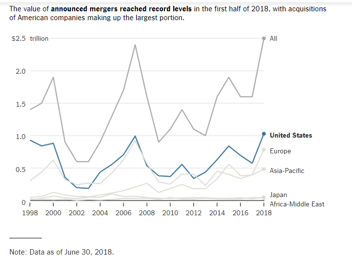
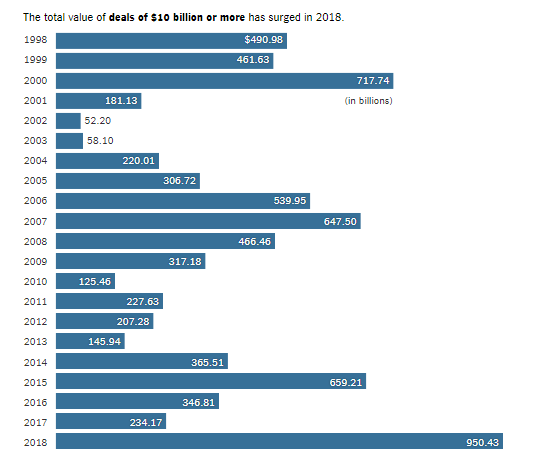
More than $2.5 trillion in mergers were announced during the first half of the year, as fears of Silicon Valley’s growing ambitions helped drive a record run of deal-making.
Four of the 10 biggest deals were struck in part to fend off competition from the largest technology companies as the value of acquisitions announced during the first six months of the year increased 61 percent from the same period in 2017, according to data compiled by Thomson Reuters. That has put mergers in 2018 on pace to surpass $5 trillion, which would top 2015 as the largest yearly total on record.
Even rising global trade tensions did not manage to stifle acquisitions: Deals involving companies based in different countries nearly doubled compared with the first half of last year, and accounted for more than 40 percent of all announced transactions.
Indeed, investors can’t be blamed for wondering whether it’s worth investing in bonds at all, now that they’re finding negative returns across the market: Investment-grade corporate bonds are down 4.9% this year, including interest payments, which puts them on track for their worst calendar-year performance since 1974, according to Bank of America Merrill Lynch
Barrons
https://www.barrons.com/articles/bolster-your-bond-portfolio-1530915409
https://seekingalpha.com/article/4130422-u-s-corporate-debt-2018
 https://www.blackrockblog.com